
This notebook will present you some useful visualisation libraries in Python that can be used for visualising geospatial data.
Why visualisation matters
Visualisation is not only useful for presenting final results, but also for validating and debugging spatial data throughout the whole processing pipeline. Interactive maps might help identify errors like incorrect coordinate reference systems (CRS), missing or duplicated geometries, outliers or gaps in coverage.
Therefore, by visually inspecting data often and early, many processing errors can be detected before expensive analysis steps are performed. This makes visualisation a powerful tool that should not be neglected.
Imports and Configuration
import sys
from pathlib import Path

import contextily as cx
import folium
import geopandas as gpd
import iplotx as ipx
import matplotlib.pyplot as plt
import networkx as nx
import numpy as np
import pandas as pd
import requests
import seaborn as sns
from folium import Element
from shapely import wkb
from shapely.geometry import box

# Importing custom functions
sys.path.append(str(Path("..").resolve()))
from src.geoai.cookbook_functions import (
    create_hexagonal_grid,
    create_polygon_grid,
    get_base_map,
)

# Configuration
CITY_NAME = "Vienna"
BBOX = "16.335005,48.187854,16.400923,48.209995"
DATA_DIR = "./osm_data"
OUTPUT_DIR = "./output"

# Computing the center of the bounding box
min_lon, min_lat, max_lon, max_lat = map(float, BBOX.split(","))
bounds = [[min_lat, min_lon], [max_lat, max_lon]]
center_lat = (min_lat + max_lat) / 2
center_lon = (min_lon + max_lon) / 2
Now, we load in the intersection data from the CSV file.
# Load the CSV file
csv_url = "https://gitlab.tuwien.ac.at/api/v4/projects/13972/repository/files/intersections.csv/raw?ref=main&lfs=true"
PROJECT_ROOT = Path.cwd()

csv_path = PROJECT_ROOT / "output" / "Vienna" / "intersections.csv"

# download the file in case it does not extist
# ensure directory exists
csv_path.parent.mkdir(parents=True, exist_ok=True)

# download only if file doesn't exist
if not csv_path.exists():
    response = requests.get(csv_url, timeout=30)
    response.raise_for_status()

    csv_path.write_bytes(response.content)
else:
    pass

df_int = pd.read_csv(csv_path)


# Convert the 'geom' hex string back into Shapely Point objects.
df_int["geometry"] = df_int["geom"].apply(lambda x: wkb.loads(bytes.fromhex(x)))

# Create the GeoDataFrame using the new 'geometry' column
intersections_gdf = gpd.GeoDataFrame(df_int, geometry="geometry", crs="EPSG:4326")
Folium
The first visualisation library that will probably come to mind now, is Folium, which we have already been using throughout this cookbook.
What is Folium?
Folium is a Python library that makes it easy to visualise data on an interactive Leaflet.js map. It allows us to take our spatial Python data and plot it directly on the map as markers, heatmaps, or choropleth grids. Unlike static plots, Folium maps are interactive, allowing users to zoom, pan, and toggle layers to explore complex spatial relationships in detail. Because Folium is built on top of Leaflet.js, maps can also easily be exported as standalone HTML files and shared easily.
There are multiple different tile providers for Folium available (think of it as the background map), like OpenStreetMap or CartoDB. For the visualisations in this cookbook, we have been using “CartoDB positron” tiles because they are simple and minimalist in style and therefore don’t distract visually from the data we’ve been plotting while still giving that visual spatial reference. But for other applications and use-cases, different tiles might be better suited or preferable.
In this next cell, we will be creating a Folium map of all the intersections we found earlier in the Feature Engineering notebook.
# Setting up the map
m_final = get_base_map(center_lat, center_lon)

# Create a feature group for all intersection points
fg_pts = folium.FeatureGroup(name="Points", show=True)

for _, row in intersections_gdf.iterrows():
    # Color logic
    color = "blue"
    if row.get("i_tpe") == "Car":
        color = "crimson"
    elif row.get("i_tpe") == "Path":
        color = "green"

    # Popup
    popup_html = f"""
    <div style="font-family: sans-serif; font-size: 12px;">
        <b>ID:</b> {row.get("osm_id")}<br>
        <b>Type:</b> {row.get("i_tpe")}<br>
        <b>Arms:</b> {row.get("num_ways")}<br>
        <b>Delta:</b> {row.get("delta"):.2f}<br>
    </div>
    """

    folium.CircleMarker(
        [row.geometry.y, row.geometry.x],
        radius=1,
        color=color,
        fill=True,
        popup=folium.Popup(popup_html, max_width=200),
    ).add_to(fg_pts)

# Add the FeatureGroup to the map
fg_pts.add_to(m_final)

# Folium doesn't have a built-in categorical legend, so we define one using HTML.
legend_html = """
<div style="
    position: fixed;
    bottom: 50px; left: 50px; width: 160px; height: 110px;
    border:2px solid grey; z-index:9999; font-size:14px;
    background-color:white; opacity: 0.8;
    padding: 10px;
    border-radius: 5px;
    ">
    <b>Intersection Type</b><br>

    <span style="
        display:inline-block;
        width:10px;
        height:10px;
        background-color:green;
        border-radius:50%;
        margin-right:6px;
    "></span> Pedestrian Only<br>

    <span style="
        display:inline-block;
        width:10px;
        height:10px;
        background-color:blue;
        border-radius:50%;
        margin-right:6px;
    "></span> Mixed<br>

    <span style="
        display:inline-block;
        width:10px;
        height:10px;
        background-color:crimson;
        border-radius:50%;
        margin-right:6px;
    "></span> Car Only<br>
</div>
"""

# Add the legend to the map
m_final.get_root().html.add_child(Element(legend_html))

m_finalWe can also add more layers to the Folium map by just adding them to the map object we created. We will be adding one layer for the Hexagonal Grid and one layer for the Rectangular Grid. We will also save our map to a HTML file.
By applying layer control to our map, we can toggle single layers on or off, so we could for example have a look at which intersections fall in which hexagonal grid cells compared to in which rectangular grid cells. You can find the layer control if you hover over the layer sign in the top right corner of the map.
# Determine Map Bounds from the intersections (with 100m buffer)
intersection_meters = intersections_gdf.to_crs("EPSG:3857")
minx, miny, maxx, maxy = intersection_meters.total_bounds
total_area = box(minx, miny, maxx, maxy)

# Hex Grid (250m)
hex_grid = create_hexagonal_grid(total_area, side_length=250)
hex_grid.set_crs("EPSG:3857", inplace=True)
hex_grid_geo = hex_grid.to_crs("EPSG:4326")
# Adding Hex Grid to the map
folium.GeoJson(hex_grid_geo, name="Hex Grid", show=True).add_to(m_final)

# Rect Grid (500m)
minx, miny, maxx, maxy = total_area.bounds
rect_grid = create_polygon_grid(
    width=maxx - minx,
    height=maxy - miny,
    cell_size=(500, 500),
    origin=(minx, miny),
    crs="EPSG:3857",
)
rect_grid_geo = rect_grid.to_crs("EPSG:4326")
# Adding Rect Grid to the map
folium.GeoJson(rect_grid_geo, name="Rect Grid", show=False).add_to(m_final)

# Apply LayerControl
folium.LayerControl().add_to(m_final)

# Save the Final Map
out_map = Path(OUTPUT_DIR) / CITY_NAME / "analysis_map.html"
out_map.parent.mkdir(parents=True, exist_ok=True)
m_final.save(out_map)

# Display the map
m_finalMatplotlib
Another widely used visualisation library in geospatial data science is Matplotlib.
What is Matplotlib?
Matplotlib is a Python library used to create static plots and maps. In geospatial workflows, it is often used together with libraries such as GeoPandas or Rasterio.
Unlike Folium, which focuses on interactive web maps, Matplotlib is mainly used for static visualisations and publication-quality figures.
We could use Matplotlib in the same way we just used Folium and just create a quick and simple plot of our intersections from the Geopandas DataFrame, like in the following code cell. We can even add a basemap to it. However, without the interactivity and the ability to zoom and pan, this plot is not as useful as the Folium map we created already.
# Transform the CRS
intersections_wm = intersections_gdf.to_crs(epsg=3857)

ax = intersections_wm.plot(figsize=(8, 6), color="lightblue", edgecolor="black")
# Add the basemap
cx.add_basemap(ax, source=cx.providers.CartoDB.Positron)
ax.set_axis_off()
ax.set_title("Matplotlib plot with static basemap")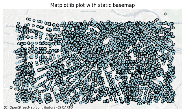
However, map plots like this are usually not the main use case for Matplotlib. While Folium answers the “Where are these intersections?” question well, Matplotlib is better suited for answering “What are the statistical characteristics of these intersections?”. It is designed to give you full control over almost every aspect of a plot, like subplots, axes, labels, colors and layouts. This makes it perfect for creating high-quality plots for publications.
For our intersections data, we can for example use it to create two subplots visualising two different statistical properties of our data. The left subplot is a simple bar chart, showing the count of intersections for each type and number of arms. When we look at the plot, we see that the vast majority of Paths intersections are 3-way intersections while for the Road intersections, there are slightly more 4-way intersections than 3-way intersections. The right subplot is a boxplot showing the distribution of the irregularity (delta). In this plot we see, that the median for both Paths and Roads is fairly similar (around 60) which means their central tendency is similar. However, the variability for the Paths is higher and shows more outliers than the Roads. This suggests that the Road network is more regular and grid-like than the Path network.
# Create a figure with two subplots side-by-side
fig, axes = plt.subplots(1, 2, figsize=(14, 6))

# Subplot 1: Grouped Bar Chart
counts = intersections_gdf.pivot_table(
    index="i_tpe",
    columns="num_ways",
    aggfunc="size",
    fill_value=0,
)

# Plotting
counts.plot(kind="bar", ax=axes[0], colormap="viridis", edgecolor="black", zorder=3)
axes[0].set_title(
    "Count of Intersections by Type and Number of Ways", fontsize=12, fontweight="bold"
)
axes[0].set_xlabel("Intersection Type (i_tpe)", fontsize=11)
axes[0].set_ylabel("Frequency", fontsize=11)
axes[0].grid(axis="y", linestyle="--", alpha=0.7, zorder=0)
axes[0].legend(title="Number of Ways", edgecolor="black")

# Subplot 2: Boxplot
types = intersections_gdf["i_tpe"].unique()
data_to_plot = [
    intersections_gdf[intersections_gdf["i_tpe"] == tpe]["delta"].dropna()
    for tpe in types
]

# Plotting
bplot = axes[1].boxplot(data_to_plot, tick_labels=types, patch_artist=True, zorder=3)

# Customizing Boxplot colors
colors = plt.cm.Pastel1(np.linspace(0, 1, len(types)))
for patch, color in zip(bplot["boxes"], colors, strict=True):
    patch.set_facecolor(color)
for median in bplot["medians"]:
    median.set(color="black", linewidth=1.5)

axes[1].set_title(
    "Distribution of Delta by Intersection Type", fontsize=12, fontweight="bold"
)
axes[1].set_xlabel("Intersection Type (i_tpe)", fontsize=11)
axes[1].set_ylabel("Delta", fontsize=11)
axes[1].grid(axis="y", linestyle="--", alpha=0.7, zorder=0)

# Final layout adjustments
plt.suptitle(
    "Statistical Summary of Intersections Data (using Matplotlib)", fontsize=16
)
plt.tight_layout()
plt.show()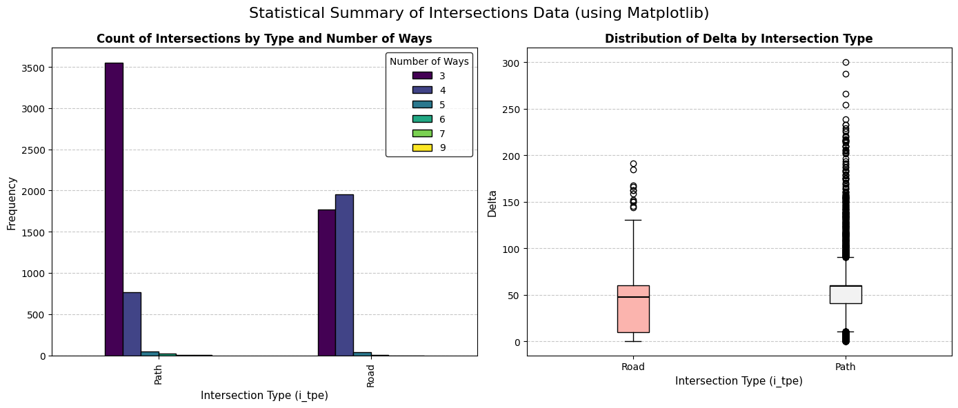
Seaborn
A third widely used visualisation library in geospatial data science is Seaborn.
What is Seaborn?
Seaborn is a Python data visualisation library built on top of Matplotlib. It is specifically designed for creating attractive and informative statistical graphics with minimal code. Seaborn integrates well with Pandas DataFrames and provides built-in themes and colour palettes, making it especially useful for exploratory data analysis and visualising statistical relationships in spatial datasets.
Now we will create the same plot in Seaborn that we just created in Matplotlib. We can directly see that it takes fewer lines of code to create the plot in Seaborn than in Matplotlib. This highlights one of the biggest differences between the two libraries: Seaborn allows users to create aesthetically pleasing and professional-looking plots more quickly and with simpler syntax. However, it also offers less flexibility and detailed control compared to Matplotlib, and highly specific customisations can sometimes become more difficult to implement.
As shown in the example, the resulting plots are visually similar and represent the same statistical information. Therefore, Seaborn is often preferred for fast and visually appealing statistical visualisations, while Matplotlib is better suited for situations requiring extensive customisation and precise control over plot elements.
fig, axes = plt.subplots(1, 2, figsize=(14, 6))

# Subplot 1: Grouped Bar Chart
sns.countplot(
    data=intersections_gdf,
    x="i_tpe",
    hue="num_ways",
    ax=axes[0],
    palette="viridis",
    edgecolor="black",
)
axes[0].set_title("Count of Intersections by Type and Number of Ways")

# Subplot 2: Boxplot
sns.boxplot(
    data=intersections_gdf,
    x="i_tpe",
    y="delta",
    hue="i_tpe",
    ax=axes[1],
    palette="Pastel1",
    legend=False,
)
axes[1].set_title("Distribution of Delta by Intersection Type")

# Final layout adjustments
plt.suptitle("Statistical Summary of Intersections Data (using Seaborn)", fontsize=16)
plt.tight_layout()
plt.show()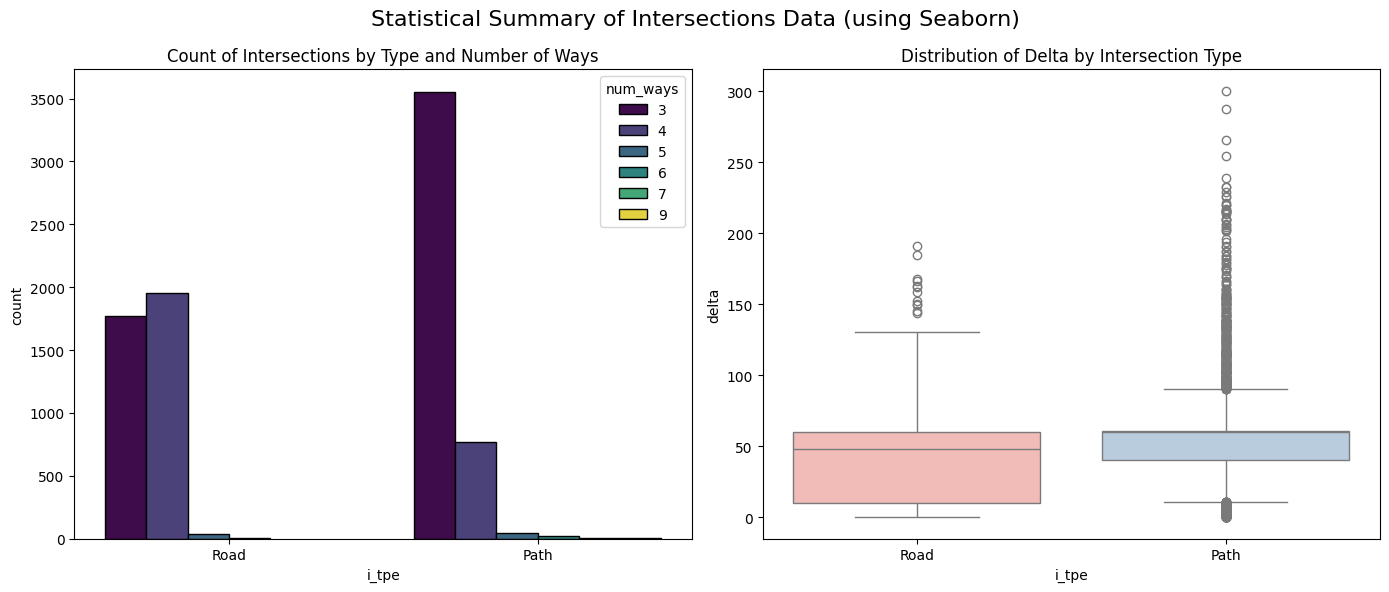
Iplotx
Finally, we will look at iplotx, a library used for visualising networks and graph structures. You have already seen this library in the Feature Engineering notebook.
iplotx is an open-source Python library that works with graph libraries such as NetworkX and igraph, using Matplotlib as its plotting backend. It allows users to create customizable network visualisations, including nodes, edges, clusters, and tree structures.
The library is particularly useful for analysing relationships and connectivity in data, such as transport networks, social networks, biological systems, or spatial connections between locations. It also supports styling and interactive exploration, making complex network data easier to understand and present.
In this example, you can see it used to plot a simple street network. If you want a more advanced network plot, you can check out the notebook on Feature Engineering.
G = nx.Graph()

# Intersections
coords = {
    0: (0, 0),
    1: (1, 0),
    2: (2, 0),
    3: (1, 1),
    4: (1, 2),
    5: (2, 1),
}

# Roads
G.add_edges_from(
    [
        (0, 1),
        (1, 2),
        (1, 3),
        (3, 4),
        (3, 5),
    ]
)

fig, ax = plt.subplots(figsize=(5, 4))

ipx.network(
    G,
    coords,
    ax=ax,
    node_labels=True,
    node_facecolor="lightblue",
    edge_linewidth=3,
)

ax.set_aspect("equal")
plt.show()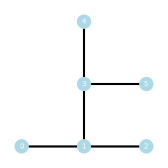
How to decide which visualisation library to use?
When choosing a visualisation library for geospatial data, the decision depends on the type of analysis and the level of interactivity required.
Folium is best suited for interactive, map-based visualisations, like displaying locations, routes, or heatmaps on real-world maps using Leaflet. It is ideal when users need to zoom, pan, or interact with the data directly.
In contrast, Matplotlib is more appropriate for creating static and highly customizable plots, making it useful for precise scientific visualisations or combining geospatial data with other chart types.
Seaborn, which is built on top of Matplotlib, is better for statistical and exploratory data analysis, offering cleaner and more visually appealing plots with less code, but it has limited geospatial capabilities on its own.
iplotx is best suited for visualising spatial networks and relationships, such as transport systems or connected geographic data.
Therefore, Folium is typically preferred for interactive mapping, while Matplotlib and Seaborn are stronger choices for analytical and statistical visualisations of spatial data, and iplotx is the better choice for network-based geospatial visualisation..
Summary
In this notebook you learned:
Why visualisation is an important step in a geospatial data handling pipeline
What Folium is and how to use it
What Matplotlib is and how to use it
What Seaborn is and how to use it